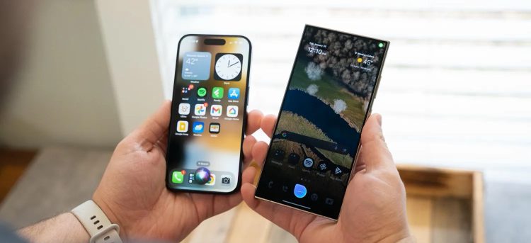
Samsung's Bixby is not a good virtual assistant. However, despite the emergence of new AI features, Samsung is not giving up yet. Recently, the company overhauled Bixby's design and... made it look like Siri.

Bixby has been part of Samsung Galaxy phones since 2018. In recent years, Bixby's strength over Google Assistant has been in its ability to adjust settings and automate tasks. When enabled, Bixby's interface is displayed above the content being displayed. A blue bar will run at the bottom edge when Bixby is listening.
However, now Bixby has an interface that looks quite similar to Apple's Siri.

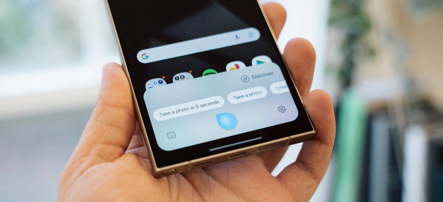
Like Siri on the iPhone, you summon Bixby by holding down the side button. A blue orb will appear. After receiving the command, a rectangular window will pop up to display Bixby's response. While the response interface is different from Siri, the listening interface is clearly inspired by it. Notably, Samsung will still support text input. A text box will appear if the user is silent after a few seconds of activating Bixby.
The change was first discovered earlier this month but appears to be rolling out more widely. The new design appears to be coming to Bixby with the v3.3.53.16 update.
It seems there are only changes to the interface. Before announcing the Galaxy S24 series, Samsung announced in a briefing with members of the media that Bixy would have no changes in functionality.
 SamFw
SamFw

