Did you notice that the Z Flip5's secondary screen looks "familiar"? According to Samsung's boss, this is completely intentional and has a very clear purpose.
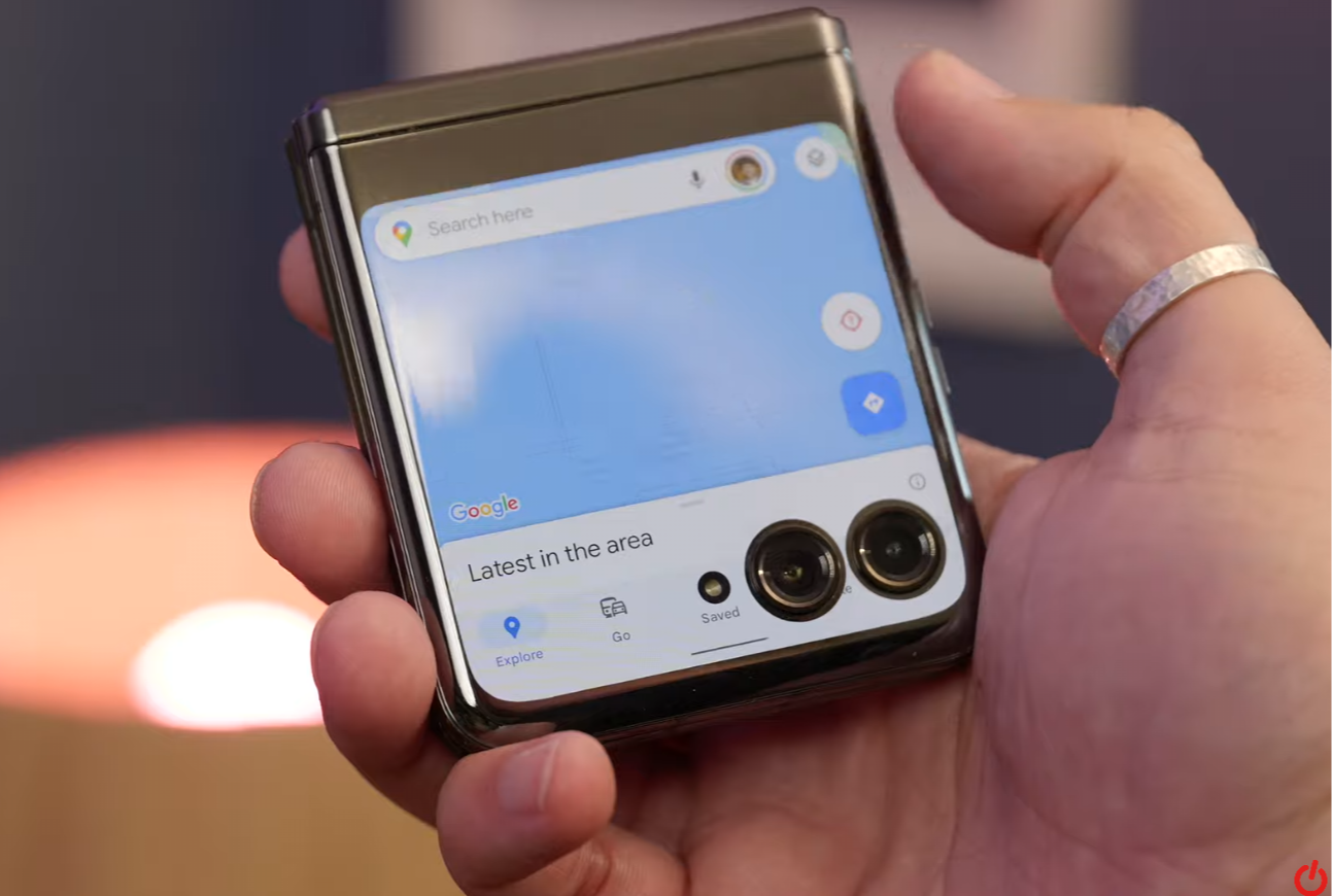
The Galaxy Z Flip5 has an external display (Samsung calls it the Flex Window) that is bigger than everyone likes, but some people wonder why it's not a "normal" rectangular shape, which naturally has an extra protrusion. outside in the lower corner makes the overall design asymmetrical. Many people also think that if Samsung completely expands this part to the edge, it will look more beautiful and have more space to display information, such as clocks, and notifications ...

The strangely shaped external screen of the Galaxy Z Flip5 is controversial.
Where did the idea come from?
Some people feel this screen design is "familiar", which is the folder icon that everyone has seen when using a computer. Samsung's boss, Mr. Tae-joong Kim, the company's Head of Foldable Phone Design recently explained, "When designing the Galaxy Z Flip5, we tested and considered a lot. Most people are used to a screen that will be rectangular, but we wanted to go beyond the traditional framework This is why the Flex Window screen of the Galaxy Z Flip5 is shaped. kind of like that."

The Z Flip5's Flex Window display is inspired by the folder icon everyone is familiar with.
"In addition, this screen design when combined with the camera cluster creates the feeling that these two components are merging into one block. As a result, we have a screen design that is not only different and recognizable but also allows us to enhance the camera experience in the future," added Mr. Tae-joong Kim.
In addition, he also said that this is one of the outstanding identification points of the Z Flip5. To put it, whether people have bad or beautiful comments, it is still something that people remember, to look at is to immediately realize that this is Z Flip5 and not other folding smartphones.
The actual effect is more than imagined
This excess screen when applied in practice turned out to be much more reasonable than imagined. The first plus is that it can accommodate navigation keys without affecting the content displayed above. Almost every app has been re-aligned so content doesn't spill down here, no buttons or icons are obscured like on the new Motorola Razer.
Without this "redundant" part, navigation operations can be limited and the content is also slightly overridden, which in general will reduce the experience on the screen significantly.

The navigation keys have their own display area, comfortable to press without obscuring the content above.
As for aesthetics, if you have used the device for a while, you will soon forget the initial discomfort (if any). If the "rabbit ears" and "mole" are still allowed by us, accepted as a must-have on the phone, there is no reason to "make a grudge" with the Z Flip5's secondary screen, right? Are not?
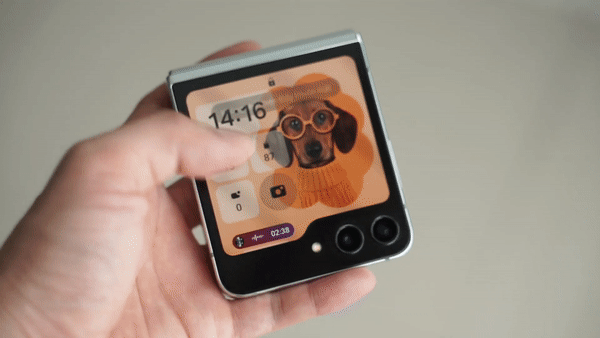
Another small plus is that the swiping experience from this "redundant" area feels more natural, the finger is automatically placed in the right position.

Even Samsung takes advantage of displaying "dynamic oscillation" when playing music here with super beautiful effects.


