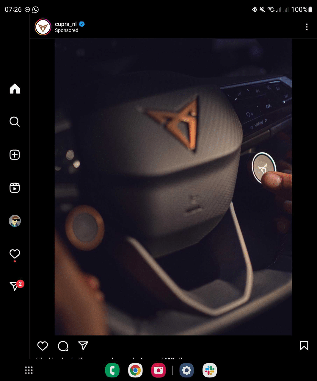
Galaxy Z Fold5 is the first folding phone model to receive Instagram's new user interface optimized for large screens.

For a long time, many people have asked Instagram to optimize the interface of their application for tablets. However, the company has always responded that this is not their priority. However, recently, the company seems to have designed a new interface for Instagram that is optimized for Android tablets. Currently, you can only experience the new interface on the Galaxy Z Fold5.
The Galaxy Z Fold5 is probably the first device to receive Instagram's new optimized interface. The navigation bar is now placed on the left side of the screen instead of below and has seven keys: Home, Search, New Post, Reels, Profile, Notifications, and Messages. However, Stories are still placed above the screen. Finally, the displayed images and videos are much larger.

On the Reels page, short videos appear with black bars on either side, while Likes, Comments, and Shares are displayed to the right of the video. This new interface has been released in the last few days. Currently, you can only experience the new interface on the Galaxy Z Fold5. So we hope Instagram will push the update to more Android devices in the near future.
It's interesting to see Meta (the company that owns Facebook, Instagram, and WhatsApp) launch apps for Android tablets and Wear OS watches while skipping Apple's tablets and watches. A few days ago, Meta launched WhatsApp for Wear OS but not for WatchOS.
Since the release of Android 12L, Google has been pushing developers to design the interface of their apps to be optimized for foldable phones and tablets. Google itself has promised to optimize over 50 of its apps for the big screen. Currently, most of Samsung's apps have been optimized for foldable phones and tablets.
 SamFw
SamFw

